Over the weekend, I stumbled upon a pamphlet and a signage.

At first glance, the signage seems to have better aesthetics and design.
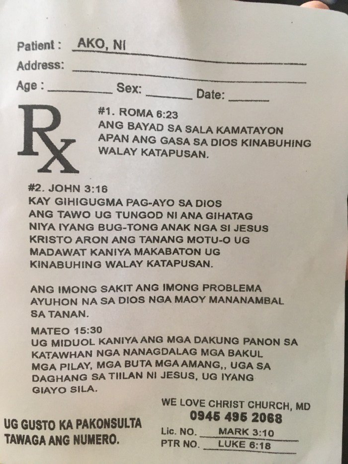
If you look closely, you’ll realize that the pamphlet is way better in terms of design. Why?
It seems like they put a lot of thought into the design. You get a feel of the message that it’s trying to convey. You might not be interested in the content, but you still end up looking at it because of the medium (the prescription format). Bonus points for the localization of the content (written in our local dialect). Props to the team/person behind the pamphlet!
One minor issue though is poor readability due to the capitalization of all the sentences. Perhaps their target audience prefers to read in ALL CAPS.
Meanwhile, the signage about free parking coupons isn’t sure of their offering. Should I order take out (we call it “dine out” here in my country) or dine inside the restaurant to get free parking coupons? The heading says “dine out” but the supporting sentence says “dine in”. More importantly, where do I present my receipt to get the coupon? It would have been great to design the signage as a pamphlet to give out inside the mall’s parking areas (go where your target audience is, right?)
So who designed it better?